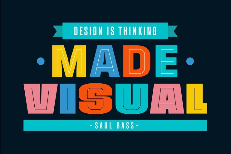
How to Use Typography for Powerful Logos

Typography is one of the most critical elements in logo design, shaping how a brand’s identity resonates with its audience. This guide explores how to use typography to create logos that leave a lasting impression, from choosing the right font style to balancing readability with aesthetics. Discover tips on pairing typefaces for dynamic effects, using custom fonts to stand out, and incorporating bold typography trends that reflect a brand’s voice. We’ll also dive into the psychology of fonts, understanding how different styles like serif, sans-serif, and script can evoke specific emotions, and how size, spacing, and positioning can transform a logo into a powerful branding tool. Whether you’re a designer or business owner, learn how to master typography to build a logo that speaks volumes about your brand’s values and mission.
Choosing the Right Typeface for Brand Personality
- Serif fonts for traditional and trustworthy brands.
- Sans-serif for modern and clean aesthetics.
- Script and decorative fonts for elegant or playful brand identities.
Creating Custom Fonts to Enhance Uniqueness
- Designing proprietary fonts that reflect the brand’s uniqueness.
- Avoiding overused fonts and investing in original typography.
Pairing Fonts for a Dynamic Effect
- Combining serif and sans-serif fonts to create contrast.
- Using different font weights and styles to emphasize brand hierarchy.
Understanding Font Psychology in Logo Design
- Exploring the emotions conveyed by serif, sans-serif, and script fonts.
- Choosing typography that resonates with the brand’s target audience.
Using Font Size and Spacing for Balance and Clarity
- Adjusting kerning and leading to ensure readability across various sizes.
- Maintaining a clean and professional look by balancing space and size.
Exploring Bold Typography Trends
- Trying oversized fonts for a bold, impactful design.
- Using minimal typography with strong characters for simplicity and modernity.
Incorporating Typographic Effects to Add Dimension
- Applying subtle textures or shadows for depth.
- Experimenting with gradient fills or outline effects in digital logos.
Positioning Typography in Symbol-Based Logos
- Aligning text with symbols for a cohesive and balanced design.
- Integrating text subtly within shapes for unique visual effects.
Ensuring Scalability and Versatility in Typography
- Choosing font styles that retain clarity in small and large sizes.
- Testing logo readability on different devices and media types.
Using Typography to Tell the Brand’s Story
- Designing logos that encapsulate a brand’s history or mission through fonts.
- Adding stylized letters or initials that symbolize the brand’s core values.


